The Elsevier Help Center has been a trusted resource for years, but today’s users expect more. Our move to Zendesk wasn’t just a platform change. It was a reinvention, built to deliver faster answers and a smarter, more intuitive support experience.
Role: UX Designer
Problem:
Solution:
The help center was ineffective at empowering users to research and resolve issues.
The support team was constantly fielding phone calls from users regarding easily solvable items. Additionally, although many users were aware of the help section, few had attempted to navigate it.
Site pages were inefficiently organized, leaving users feeling frustrated and relevant pages unread.
Searching for relevant research proved a hassle for many trying to navigate the old platform. This dramatically reduced its use value, and users reported feeling friction when using the old interface.
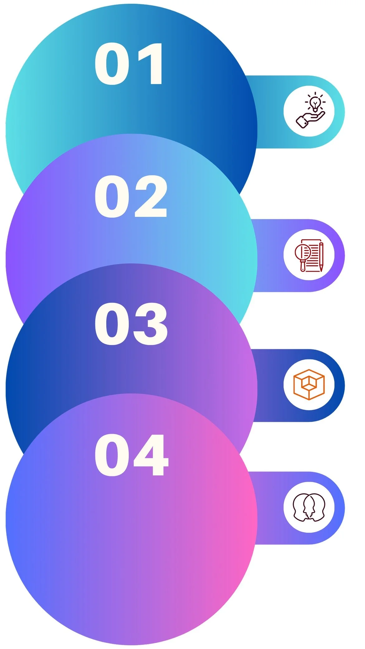
Idea
Researching, analyzing, and reviewing the product and identify approaches to improve usability.
Design
Sketching, wireframing, and creating interactive models to visualize user interaction.
Build
Meet key requirements, align with user needs, and ensure an intuitive experience.
Share
Presenting the product with the public for feedback, then using the results to make changes and improvements.

How did you learn where users were getting stuck?
We began by analyzing a year’s worth of usage metrics to identify which of the 19 available topics users engaged with most. To validate these patterns, we cross-referenced the findings with qualitative input from our support team, comparing common user concerns with click behavior. This combination of quantitative and anecdotal evidence helped surface blind spots and informed our strategy before we began redesigning the Help Center.
Switching to Zendesk allowed us to address long-standing navigational challenges by adopting a clearer content hierarchy: categories, sections, and articles. This three-level structure aligns with user experience best practices, helping people locate answers efficiently without getting lost.
By analyzing the technical range across our user personas, we identified three distinct proficiency tiers—new users, typical users, and experts. The core challenge became: how do we guide each of them to the right destination, fast?
UX Research
Where am I? What should I do? What else is available?
For users of Digital Commons, clarity is everything. Yet much of the platform’s terminology had evolved internally—mirroring system logic rather than user understanding. Labels and features were often platform-specific, lacking the kind of universal language that supports intuitive navigation.
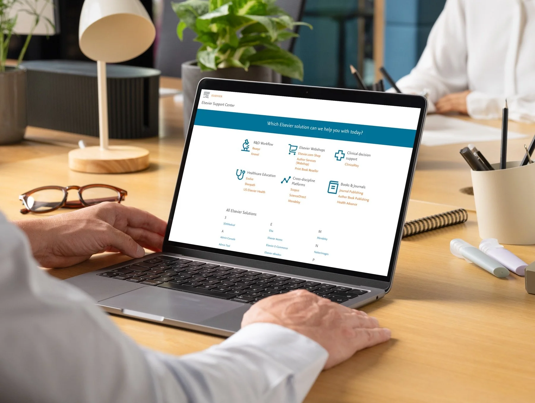
The previous Help Center compounded this with overchoice—19 different category prompts greeted users on the homepage, creating cognitive overload at precisely the moment they needed simplicity.
Because the Help Center is often where users turn in moments of confusion, our first priority was to resolve those structural and linguistic roadblocks, streamlining the experience so users could find what they needed, faster.


The Help Center was simplified with fewer categories and a stronger search bar, since most users rely on search to find answers. The new design is calm, easy to navigate, and helps users know where they are and what to do next.
7 users tested - ages 25-60 - varying web proficiency
I built an interactive mockup using InVision and organized usability tests to compare the new layout with the old one. During testing, we also noted potential UI adjustments to make the experience smoother and more intuitive.
Feedback showed the updated design was clear, user-centered, and encouraged visitors to quickly find what they needed and discover additional resources. All participants completed their tasks confidently and without any issues.

Results

Since integrating the Bepress Help Center into the broader Elsevier support ecosystem, we’ve seen a measurable decline in direct support requests and a marked increase in self-service engagement.
The Help Center and Community are now key touchpoints in our customer experience strategy, serving as both a first line of support and a feedback channel for identifying user pain points across all tiers.
An unexpected benefit has been the emergence of community advocates—active users who help troubleshoot, share insights, and surface feature requests that inform product development.
Between January 24, 2018 and January 24, 2020, the redesigned Help Center and Community were accessed over 10,000 times—a 65% increase in engagement compared to the previous version.